There is an old adage in advertising that says, “people need to see an ad seven times before they are influenced by it.” What does this mean for your incentive programs?
While advertisers may argue about the exact right number (I’ve seen some say that it takes 20 times – really, that seems overkill?), the concept that multiple views of information drives behavior has been shown to be true. This is called “effective frequency” in the advertising world.
In our internal communication world, we call it a communication campaign and organizations don’t use campaigns as often as they should. In the world of incentives, a full campaign can be a fantastic tool to add to your toolbelt.
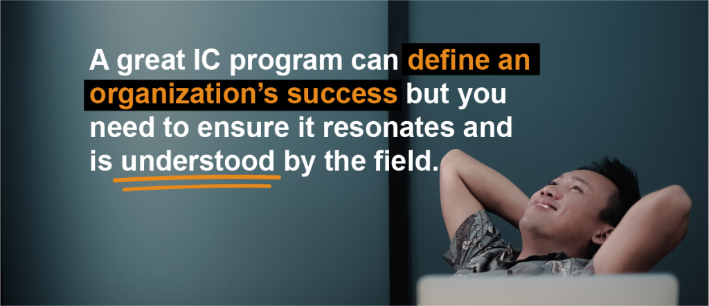
Create a Great IC Program AND Make Sure it is Understood
Incentive compensation professionals work hard at developing incentive plans that drive employee motivation while also meeting their company’s strategic objectives.
In the past, this has been achieved by using rules of thumb and stringent financial analysis. Yet, hard work is not enough in today’s turbulent times.
So far in our design series of blogs, we have touched upon the concept of applying behavioral science to graphic design, and how reducing cognitive load can increase understanding, reduce myopic focus and drive home the key points you want your audience to grasp.
Today we are going to dive deeper into the visual element and explore “why graphics matter.” We utilize the concepts we will lay out in our employee communications, but the value does not stop there. Whether you are in communications, marketing, advertising, or trying to engage employees through internal Communications, this will apply to you. So, sit back, relax, and absorb.
Graphics are fun, graphics are pretty (well some are, beauty is in the eye of the beholder), graphics make information less boring – but there is far more to graphics than one might expect. When properly used graphics:
Too often we don’t have a reference point for data…really, do you know how tall 80.1 inches really is? The Boston Globe (see here) created this info graphic to represent the snowfall in 2010/2011. They did a fantastic job.
Here is why it works:
1. Shows data relative to something that we know – we can put it in context
2. Graphically simple – yet conveys a lot of information
3. Fun – how can you not chuckle when you see the Shaq-o-meter
While this is funny, it is also a little sad. Sad because it actually happens – and not just at Microsoft, but across the board in industry today.
In our striving to add more and make sure things are clear and understandable, we “muck up” stuff. I’ve witnessed this type of “editing” many times in the work that we do.
The intent is always good. Clients saying, “we need to add in the eligibility rules to the PPT” or “the graph isn’t to scale and can we add some arrows in to show how people should read it?” or “can we just put an earning example in here?”
However, in the end, what started out as a simple, memorable, and I would say engaging piece – ends up to be just another jumbled piece that doesn’t elicit any emotion or change any behavior. We tend to put too much in and don’t leave enough out. I understand that compensation communication (or other “important” communication) needs to have the details – I just think that they shouldn’t be on the box (or in most PPTs or overview documents).
This means that some of our communication pieces are the “packaging” – they grab our attention; they create a feeling or expectation. Other communication needs to be the “set up instructions” – these are the simple how to use directions; the easy to understand graphics that show you how to plug it in. Finally you need the “warranty and trouble shooting information” – those legal parts that get into the nitty gritty; the details of how things work so that those few who really care can understand.
Watch this and laugh – but think about how it applies to you and your business communications. How much do you try to cram in? Is it too much?
I am a big believer in the motto – simpler is better. I also believe that emotion is more memorable than logic. So make sure that you don’t create a Microsoft package when you could make an Apple.
Have you ever had this happen to you? Give a comment and let us know.
Ok, this is too funny. I think it is real, but even if it isn’t, it is good. Shows you the power of being creative, using different types of media, and having good production…this is what every incentive compensation plan communications needs but rarely gets. Think of the power of this video being about your compensation plan and being introduced to your sales force at your next National Meeting…WOW! Motivation is about more than just the reward – it is about how we communicate, how we actively engage, how we convey the message and get people to not only notice, but care…and maybe even have a little bit of fun!