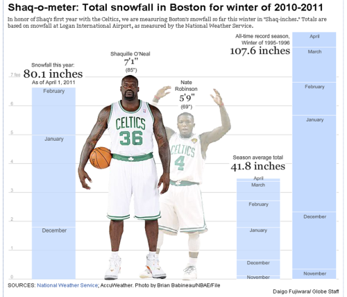
Ok, this is how information should be presented!
Too often we don’t have a reference point for data…really, do you know how tall 80.1 inches really is? The Boston Globe (see here) created this info graphic to represent the snowfall in 2010/2011. They did a fantastic job.
Here is why it works:
1. Shows data relative to something that we know – we can put it in context
2. Graphically simple – yet conveys a lot of information
3. Fun – how can you not chuckle when you see the Shaq-o-meter


Start a conversation! What do you think of these insights?